
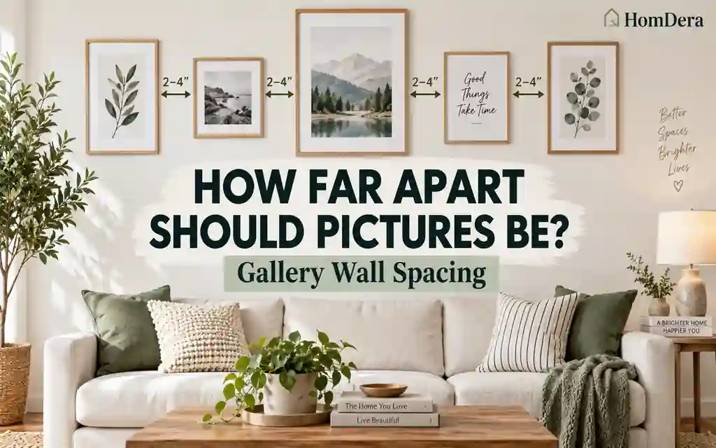
A gallery wall can go wrong by only an inch at a time. The first picture looks fine, the second is a little too far away, the third is measured from the second instead of from the wall, and by frame number six the whole arrangement has quietly migrated toward a lamp.
The good news is that picture spacing is easier than it looks once you stop treating every frame as a separate object. Decide how the complete group should sit on the wall, choose a consistent clear gap, check the height in relation to furniture and eye level, and then transfer exact frame centers or hook positions. This guide covers both tidy rows and grids, plus the less mathematical mixed-frame gallery walls that need more visual judgement.
Quick answer: for many gallery walls, start with about 2–3 in (5–7.5 cm) of clear space between neighboring frames. Smaller matching frames can often sit closer; large artwork may need 3–4 in (7.5–10 cm) or more. On an empty wall, a gallery center around 57–60 in (145–152 cm) from the finished floor is a useful starting range—not a universal rule.
Measure the gap edge to edge between the finished frames, not between the prints inside them. A 3 in gap means 3 in of visible wall from one outside frame edge to the next.
Picture spacing, gallery height and layout without guesswork
How Far Apart Should Pictures Be?
There is no single correct gap for every wall, but there is a useful design principle: the space between pictures should be small enough that the pieces read as a group and large enough that each frame still has room to breathe. For a typical home gallery wall, 2–3 in (5–7.5 cm) is a strong place to begin a mock-up.
Practical starting gaps between picture frames
| Clear gap | Where it often works | What it feels like |
|---|---|---|
| 1.5–2 in / 4–5 cm | Small matching frames, compact grids, narrow walls | Tight and deliberate; mistakes in alignment become more noticeable |
| 2–3 in / 5–7.5 cm | Many medium-size gallery walls and photo grids | Connected without feeling crowded |
| 3–4 in / 7.5–10 cm | Larger frames, looser mixed arrangements, bigger walls | More breathing room while still reading as a group |
| More than 4 in / 10 cm | Very large art or deliberately open compositions | Can work, but smaller pieces may start to look unrelated |
Do not choose a gap because a chart says 2.5 inches. Tape two real frame outlines on the wall at 2 in, 3 in and 4 in. The correct number is usually obvious once you see the actual scale.
Treat the Whole Gallery Wall as One Large Piece
Before marking a single nail, imagine a rectangle around the entire arrangement. That invisible outer box has a width, a height and a center. Those three measurements matter more than whether the third frame is a millimetre left or right while you are still planning. If the outer box is well placed, the wall usually feels balanced even before anyone notices the individual pictures.
See one composition before you see six frames
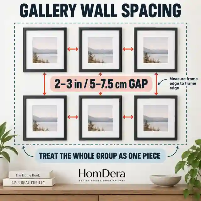
Draw or imagine one boundary around the complete arrangement.
Measure the gap between outside frame edges, not between images or mats.
Center the complete group within the intended wall zone instead of centering each row independently unless the design calls for it.
For a regular grid, equal gaps create the visual rhythm; the outer wall margins do not need to equal the internal frame gap.
Should Pictures Be Centered at 57 or 60 Inches?
You will see both 57 in and 60 in used as eye-level rules. They are not competing building codes. They are design starting points. Framebridge commonly uses about 57 in to the vertical center, while Pottery Barn uses roughly 60 in. In practice, a useful empty-wall starting zone is about 57–60 in (145–152 cm) to the center of the artwork or the center of the whole gallery grouping.
When the gallery center may move
| Situation | Starting approach | Why you may adjust it |
|---|---|---|
| Empty living-room wall | Center around 57–60 in / 145–152 cm | Keeps the composition near normal standing eye level |
| Gallery above a sofa or console | Set the lower edge from the furniture first | The art and furniture need to read as one composition |
| Hallway | Eye level or slightly higher can work | People usually view the art while standing and at closer range |
| Dining area | Check both standing and seated views | A mathematically perfect standing height can feel high while seated |
| Very large gallery wall | Center the overall group, then check ceiling and furniture clearance | The outer edges matter as much as the nominal center |
The useful rule is not “57 inches forever.” It is “start near normal eye level, then let the room vote.” Furniture, low ceilings, tall panels, stair geometry and the size of the complete arrangement can all change the answer.
How High Should Pictures Hang Above a Sofa, Console or Bed?
When pictures hang above furniture, the relationship to that furniture is usually more important than a floor-to-center number. Published design guides vary: common recommendations for the lower edge of artwork span roughly 4–10 in (10–25 cm) above the furniture. For many rooms, mocking up around 6–8 in (15–20 cm) first gives a useful middle starting point.
Starting clearances above furniture
| Furniture below | Useful mock-up range | What to check |
|---|---|---|
| Sofa / couch | About 6–8 in / 15–20 cm | The gallery should feel connected to the sofa, not parked near the ceiling |
| Console / credenza | About 4–8 in / 10–20 cm | Allow for lamps, plants and objects placed on the surface |
| Bed headboard | About 6–10 in / 15–25 cm | Check headboard height, pillows and whether anyone can bump the frames |
| Desk | About 6–10 in / 15–25 cm | Measure from the actual visual top: monitor, shelf or desk surface as appropriate |
Tape the bottom edge of the proposed gallery on the wall before deciding the center height. Above furniture, the lower edge is often the easier measurement to judge with your eyes.
How Wide Should a Gallery Wall Be Above Furniture?
A gallery that is much narrower than the furniture below can look timid; one that extends beyond both sides may feel top-heavy. Around two-thirds of the furniture width is a useful design reference, not a fixed target. A composition somewhere around 60–75% of the sofa, console or headboard width often gives you a sensible range to test.
Gallery width as a proportion of the furniture below
| Gallery width | Likely visual effect | When it can work |
|---|---|---|
| Less than about 50% of furniture width | Can feel small or disconnected | Small intentional art cluster, narrow architectural zone |
| About 60–75% | Balanced starting range | Many sofas, beds and consoles |
| About 75–90% | Strong, expansive composition | Long furniture and larger rooms with enough side breathing room |
| Wider than the furniture | Can dominate the wall | Only when the whole room composition clearly supports it |
Equal Frames: The Simple Gallery Wall Grid Formula
Matching frames are the easiest case because the entire layout can be calculated before anything touches the wall. For one full row, add the widths of the frames and the clear gaps between them. A row of three frames has two gaps; a row of four has three.
Row width = (number of frames × frame width) + ((number of frames − 1) × clear gap)

Grid height = (number of rows × frame height) + ((number of rows − 1) × clear gap)

Side margin = (available wall width − gallery width) ÷ 2
How wide is a 3 × 2 gallery wall using six 12 × 16 in frames with a 3 in gap?
Answer: Three 12 in wide frames use 36 in. Two 3 in gaps add 6 in, so the gallery is 42 in wide. Two 16 in high rows use 32 in, plus one 3 in vertical gap, so the complete grid is 35 in high.
Explanation: The gap exists only between neighboring frames. Do not add a gap after the last frame or silently include the outside wall margin in the frame-spacing calculation.
A grid is just frames plus the spaces between them
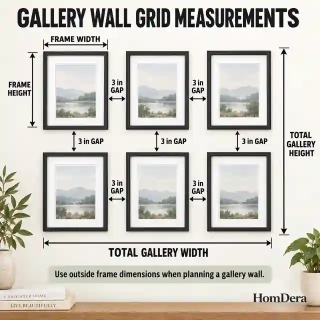
Three columns create two horizontal gaps per row.
Two rows create one vertical gap.
Use the outside frame dimensions, including the frame moulding.
Once the total width is known, center that width inside the available wall zone and mark every frame from one reference edge.
How to Space Pictures in One Horizontal Row
A single row works well above a sofa, sideboard, dining bench or long hallway wall. The cleanest method is to calculate the full row width first, center that row inside the intended zone, and then mark every frame center from the same left-hand reference. Do not hang the first frame and keep measuring from the frame you just installed; tiny errors accumulate.
Where does a row of four 14 in frames with 2.5 in gaps begin on an 84 in wall zone?
Answer: The frames use 4 × 14 = 56 in. Three gaps use 3 × 2.5 = 7.5 in. The row is 63.5 in wide. The remaining space is 84 − 63.5 = 20.5 in, so the row begins 10.25 in from the left boundary and ends 10.25 in from the right boundary.
Explanation: Centering the complete row first makes the outside margins equal. The internal gap stays 2.5 in; it does not need to match the much larger side margins.
Mixed-Size Gallery Walls Need a Different Method
A salon-style wall with different frame sizes cannot be solved honestly with one equal-grid formula. You can still keep a consistent visual spacing, but the composition is controlled by balance: the biggest pieces, dark frames, bright colours and strong images all carry more visual weight than a tiny pale print.
- Choose one anchor piece or one central cluster before filling the edges.
- Keep most neighboring edge-to-edge gaps within a narrow range rather than forcing every centerline into a grid.
- Spread large or visually heavy pieces through the composition instead of stacking them all on one side.
- Avoid accidental narrow slivers of wall between two frames when the rest of the gallery is much more open.
- Check the outer silhouette of the whole group from across the room.
- Lay the arrangement on the floor or use full-size paper templates before drilling.
The HomDera Gallery Wall Spacing Calculator is intentionally designed for matching frame sizes in a row or grid. For mixed-size salon walls, use the spacing guidance and mock-up method in this article rather than pretending unequal rectangles form a mathematically uniform grid.
Mixed frames: control the gaps, then judge the visual weight
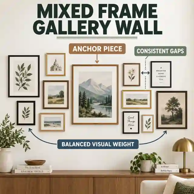
Start with the largest or most important piece instead of filling one corner from left to right.
Keep the nearest frame-to-frame gaps visually related even when the centers do not align.
Balance dark, colourful or oversized pieces across the full composition.
Step back frequently; mixed galleries are judged as shapes and visual weight, not only with a ruler.
Choose an Anchor Piece Before Filling the Wall
An anchor piece gives a mixed gallery a point of gravity. It can be the largest frame, a favourite artwork, a portrait, a mirror or simply the piece with the strongest colour. The anchor does not have to sit exactly in the geometric center, but the other frames should feel as if they belong to the same conversation.
- For a symmetrical wall, place the anchor near the visual center and build outward.
- For an organic arrangement, move it slightly off-center and balance it with several smaller pieces on the opposite side.
- Above furniture, align the anchor to the furniture composition rather than automatically to the entire room wall.
- If one frame is dramatically darker or thicker than the rest, treat it as visually larger than its tape-measure dimensions.
- Do not force a meaningful piece into a bad location just because the grid looks tidy on paper.
Should Small and Large Frames Have the Same Gap?
Not always. Tiny frames separated by 4 in can look like unrelated objects, while two oversized artworks only 1 in apart may feel cramped. Scale the spacing with the physical size and visual weight of the frames, but keep the variation controlled enough that it looks intentional.
Spacing by frame scale
| Frame scale | Gap worth testing first | Planning note |
|---|---|---|
| Small frames, roughly 5 × 7 to 8 × 10 in | 1.5–2.5 in / 4–6 cm | Close spacing helps small pieces form one stronger group |
| Medium frames, roughly 11 × 14 to 16 × 20 in | 2–3 in / 5–7.5 cm | A versatile range for rows and grids |
| Large frames, roughly 18 × 24 in and above | 3–4 in / 7.5–10 cm | Larger pieces can carry more surrounding wall space |
| Mixed sizes | Usually keep most gaps within about 2–4 in / 5–10 cm | Judge nearest edge-to-edge spacing rather than forcing equal center distances |
Horizontal and Vertical Gaps Do Not Have to Be Different
For a regular grid, using the same clear gap horizontally and vertically is the simplest way to create a calm, repeatable rhythm. You can use different gaps, but it should be deliberate—for example, a set of paired frames with tighter spacing inside each pair and a larger gap between pairs. If the difference is only half an inch because the measuring wandered, it usually reads as a mistake rather than a design decision.
Equal spacing does not mean equal white space inside every frame. Mats, image crops and frame widths can make two physically identical frames feel different. Judge both the outside geometry and the artwork inside it.
Hallways, Stairs and Dining Areas Need Their Own Height Check
The same gallery can feel low in a hallway, high above a dining bench and completely wrong on a staircase. Context changes how people see the wall. Use the 57–60 in center range only as the first mock-up, then view the composition from the positions people actually occupy.
Gallery-wall planning by location
| Location | What matters most | Useful check |
|---|---|---|
| Living room | Relationship to sofa, console, fireplace and seated sight lines | Stand at the doorway and sit on the sofa before finalising height |
| Hallway | Close viewing and long horizontal perspective | A slightly higher center can feel comfortable for standing viewers |
| Dining room | Both standing and seated viewing heights | Check the wall from a dining chair, not only while standing with a tape |
| Staircase | The slope and repeated viewing path | Plan a deliberate rising baseline or centerline rather than copying a level-room grid |
| Bedroom | Headboard width, pillows and safe clearance | Treat the bed and artwork as one composition |
Measure the Frame, Not Just the Photo or Print
A 12 × 16 in print can become a 17 × 21 in object once a mat and frame are added. Gallery spacing is based on the finished outside frame size because that is what occupies the wall. Measure every frame after it is assembled, especially if different frame profiles or mats are involved.
If you are ordering frames before choosing the layout, write down both dimensions: image size and finished frame size. Only the finished outside dimensions belong in the wall-spacing calculation.
Frame Center Is Not Always the Nail Position
A frame can be perfectly centered on paper and still hang too low if the hook is placed at the frame center. The hanging point normally sits below the top edge. With picture wire, that drop also changes when the wire is pulled upward under load. Measure the real distance from the top of the finished frame to the loaded hanging point.
Top edge height = frame center height + (frame height ÷ 2)

Centered hook height = top edge height − hook drop

If the hanger is horizontally centered:
hook X = frame center X
A 20 in high frame has its center at 60 in from the floor, and the loaded wire reaches a hook 3 in below the top. Where should the hook be?
Answer: The top of the frame should be 60 + 10 = 70 in above the floor. The hook sits 3 in below that top edge, so its height is 67 in.
Explanation: The frame center controls the visual position; the hook position depends on the hardware. Confusing those two measurements shifts every frame.
Measure the hook drop with the hardware under realistic tension
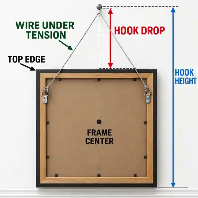
Find the intended frame center first.
Measure from the top of the frame down to the actual hanging point.
For wire, pull it upward as it will sit on the hook rather than measuring the slack wire.
Two D-rings or two hooks need their own horizontal spacing and should not be reduced to one imaginary centered nail.
Layout maths does not choose safe fixings. Match hooks, screws, anchors or wall plugs to the actual frame weight and wall construction, and check for wiring, plumbing and other hidden services before drilling.
Wire, Sawtooth Hangers and D-Rings Change the Marking Method
The visible frame position can stay exactly the same while the wall marks change completely. A centered sawtooth hanger needs one point. A wire creates a vertical drop that depends on tension. Two D-rings require two points at a known distance from the top and side edges. Heavy frames may use specialised hardware or rails. Plan the gallery first, then translate each frame position into the specific hardware geometry.
- Centered sawtooth: measure the vertical drop from frame top to the tooth that actually sits on the hook.
- Picture wire: pull the wire upward at the intended hook point and measure the loaded drop.
- Two D-rings: measure both vertical drop and horizontal distance between ring centers.
- French cleat or hanging rail: position the rail from the final frame top and the manufacturer's engagement dimension.
- Adhesive hanging products: follow the product's wall-surface, weight and curing requirements rather than assuming every painted wall is suitable.
Use Paper Templates Before You Make Holes
Full-size paper templates turn an abstract set of measurements into something you can judge from across the room. Trace each frame onto inexpensive paper, label it, mark its center and hanging point, then tape the templates to the wall. This is especially valuable for mixed-size galleries and arrangements above furniture.
- Trace the outside size of every finished frame.
- Label each template so the artwork does not get swapped later.
- Mark the vertical and horizontal center of the frame.
- Transfer the measured hook, wire or D-ring location onto the paper.
- Tape the full composition to the wall with low-tack painter's tape.
- Check the gap, total width, lower edge and furniture relationship from normal viewing positions.
- Move paper, not nails, until the arrangement feels right.
- Only then transfer the final hanging marks to the wall.
Common Gallery Wall Spacing Mistakes
Mistake, what it causes and a better approach
| Mistake | What usually goes wrong | Better approach |
|---|---|---|
| Measuring the photo instead of the frame | The real gaps are smaller than planned | Use finished outside frame dimensions |
| Measuring each new frame from the previous frame | Small errors accumulate across the wall | Reference all frame centers from one wall boundary or datum |
| Using the same 57 or 60 in center above every sofa | The gallery can float too high above furniture | Set the furniture relationship first, then check the center |
| Making outside margins equal to the internal frame gap | The gallery stretches awkwardly across the wall | Treat the arrangement as one object with its own side margins |
| Using huge gaps around small pictures | The collection breaks into unrelated pieces | Reduce spacing until the group reads together |
| Forcing a mixed gallery into a perfect grid | Unequal frame sizes create awkward alignments | Balance edge gaps and visual weight instead |
| Marking nail positions before measuring hardware | Frames hang too high or low | Calculate the visible frame position first, then the hanger geometry |
| Drilling before a full-size mock-up | A correct calculation can still look wrong in the room | Use paper templates or painter's tape first |
Worked Example: Six Frames Above an 84-Inch Sofa
Suppose you have six matching 16 × 20 in frames, arranged three across and two rows high, with a 3 in gap. The sofa is 84 in wide and the top of its back is 34 in above the floor. You want the gallery to feel connected to the sofa without pushing the top too close to an 8 ft ceiling.
Example dimensions
| Input | Value | What it controls |
|---|---|---|
| Sofa width | 84 in | Reference for overall gallery width |
| Frame size | 16 × 20 in | Outside finished frame dimensions |
| Layout | 3 columns × 2 rows | Six frames total |
| Clear gap | 3 in | Horizontal and vertical spacing |
| Sofa-back height | 34 in | Reference for the lower edge of the gallery |
| Trial clearance above sofa | 7 in | Places the gallery bottom at 41 in from the floor |
- Gallery width = 3 × 16 + 2 × 3 = 54 in.
- Gallery height = 2 × 20 + 1 × 3 = 43 in.
- The gallery is 54 ÷ 84 = about 64% of the sofa width, a sensible proportion to test.
- With a 7 in clearance above a 34 in sofa back, the gallery bottom sits at 41 in.
- The gallery center is 41 + 43 ÷ 2 = 62.5 in above the floor.
- That center is higher than the common 57–60 in empty-wall range, but the furniture relationship is strong and the top remains at 84 in—12 in below an 8 ft ceiling.
- Mock up the 41 in bottom edge and 54 × 43 in outer rectangle before deciding whether to lower the whole group by an inch or two.
Why the furniture can matter more than the 57-inch rule
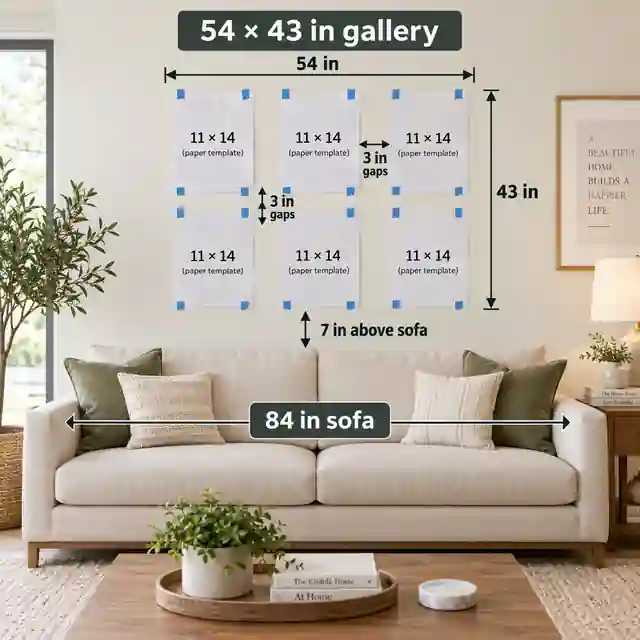
The six-frame grid is 54 in wide and 43 in high.
A 7 in trial gap above the sofa places the gallery center at 62.5 in.
That does not make the layout wrong; the grouping is being positioned relative to the furniture instead of an empty wall.
Paper templates let you lower or raise the entire 54 × 43 in block before any hardware is installed.
Frequently Asked Questions
Is 2 or 3 inches better between pictures?
Both can work. Two inches creates a tighter group and often suits smaller frames or a clean photo grid. Three inches gives a little more breathing room and works well with many medium-size frames. Mock up both at full scale; a one-inch change across several gaps can noticeably change the total gallery width.
Should pictures be centered at 57 or 60 inches?
Treat 57–60 in (145–152 cm) to the center as a practical starting range for an empty wall. It is not a construction standard. Above furniture, on stairs or in unusually proportioned rooms, the gallery may look better higher or lower.
How far above a couch should a gallery wall hang?
A useful first mock-up is about 6–8 in (15–20 cm) from the top of the sofa to the bottom of the gallery. Published design guidance spans a wider range, so check the actual sofa height, gallery size and ceiling instead of treating one number as mandatory.
Do mixed-size frames need exactly equal spacing?
No. Mixed-size gallery walls usually look better when the nearest edge-to-edge gaps stay visually consistent rather than mathematically identical. Keep most gaps within a narrow range, then adjust slightly for large frames, awkward corners and visual balance.
Should the gallery wall be centered on the wall or the furniture?
If the gallery clearly belongs to a sofa, console, bed or dining bench, centering it on that furniture group usually creates the stronger relationship. If the wall is visually independent, center the gallery within the usable wall zone. Architectural boundaries such as doors, built-ins and fireplaces can matter more than the room's full wall width.
Final Gallery Wall Check Before You Drill
- The finished outside size of every frame has been measured.
- The chosen clear gap has been tested at full scale.
- The complete gallery width and height fit the intended wall zone.
- The whole composition is centered on the correct reference: wall zone, sofa, bed or console.
- The lower edge has been checked against any furniture below.
- The gallery center has been compared with the 57–60 in starting range without treating it as mandatory.
- Mixed-size frames were balanced by visual weight rather than forced into a false grid.
- Frame centers were measured from one consistent reference to avoid cumulative error.
- Hook drop, wire tension or D-ring positions were measured on the actual frames.
- Hanging hardware is suitable for the frame weight and wall construction.
- Hidden wiring, plumbing and other services have been considered before drilling.
- The full layout has been tested with paper templates or painter's tape.
If you remember only one thing, make it this: spacing is not a magic number—it is a relationship. Start around 2–3 in between typical frames, treat the gallery as one large object, place that object sensibly on the wall, and then convert the design into exact frame and hook marks. A ruler can make the gaps equal; the mock-up is what tells you whether the wall actually looks right.